Be Me
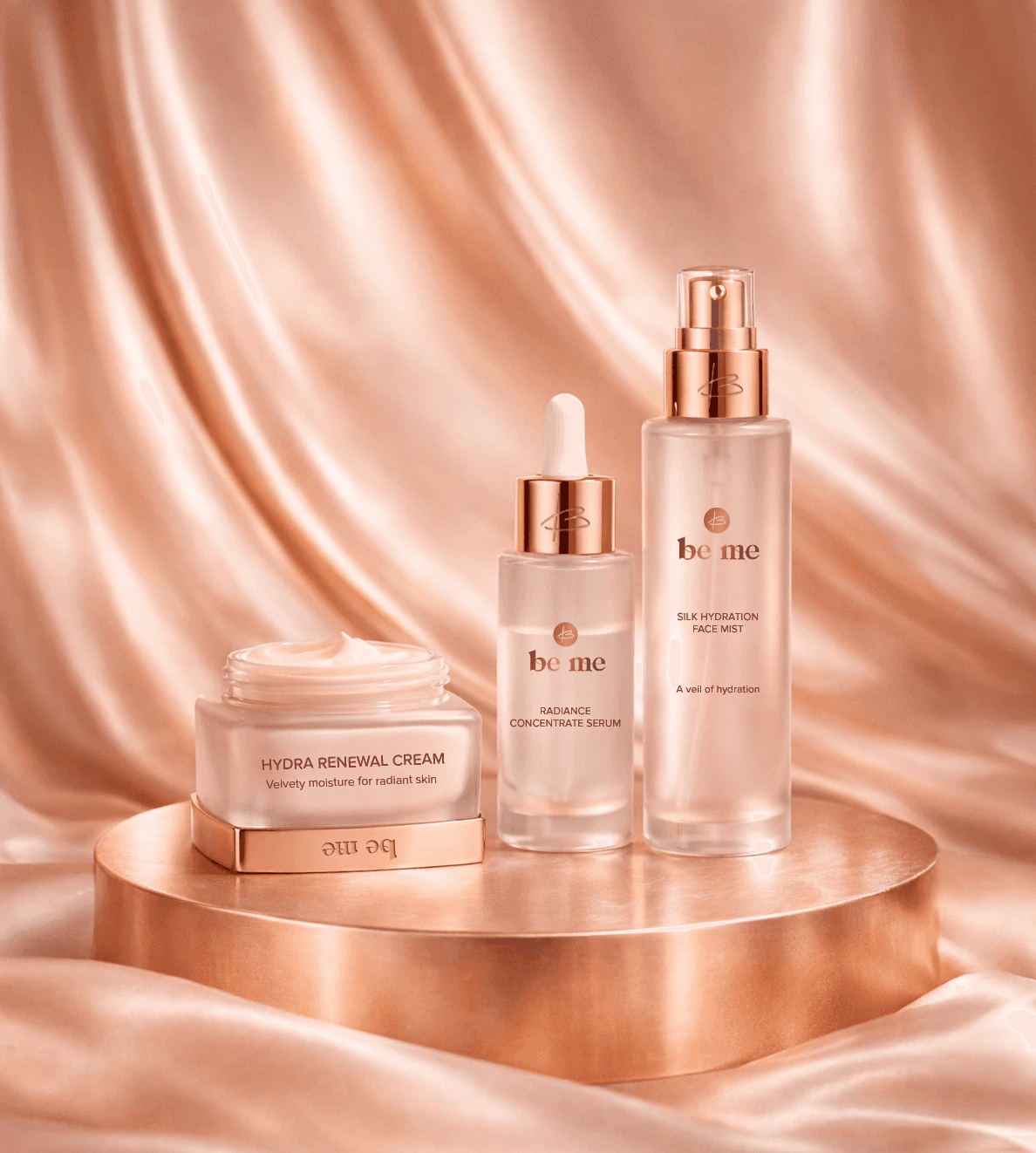
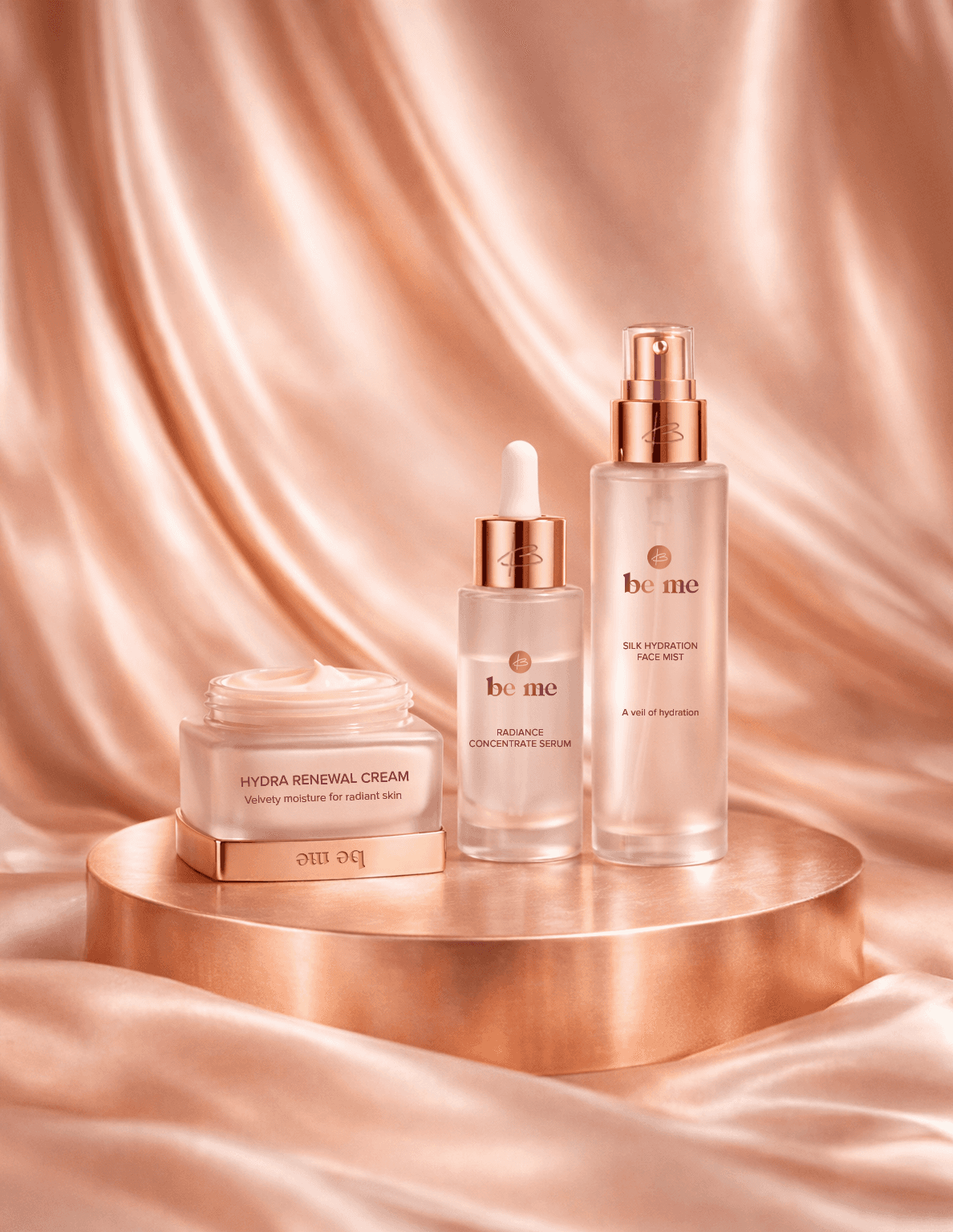
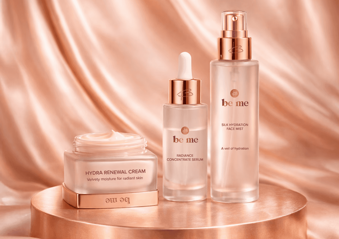
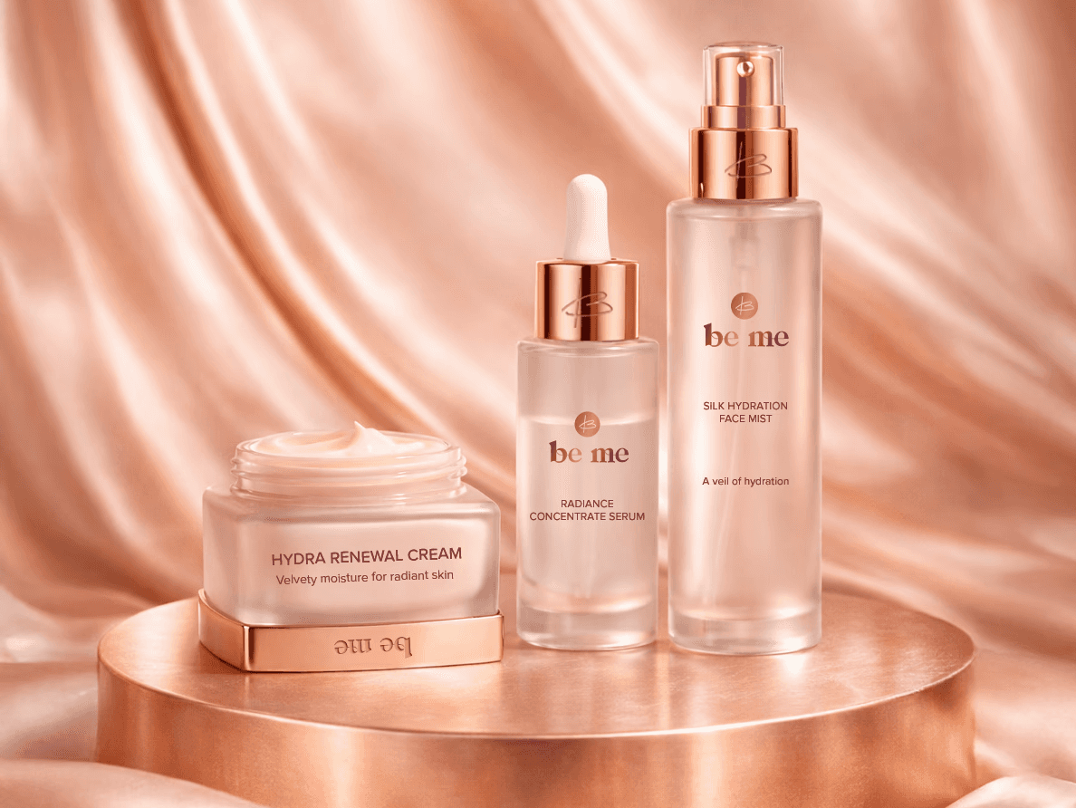
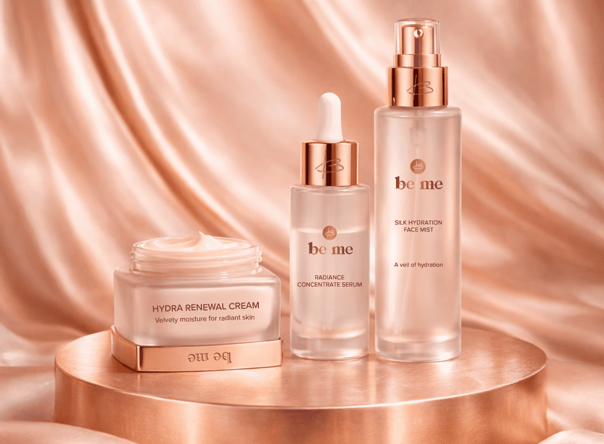
Be Me is a modern clean-beauty and wellness brand rooted in self-expression, sustainability, and daily ritual. The goal of this project was to design a logo system that feels minimal yet warm, premium yet approachable and feel like a brand that encourages customers to embrace authenticity through simple, intentional care. This exploration focused on developing a flexible logo and icon system that could scale seamlessly across packaging, digital touchpoints, and physical products. I was contracted by Brand & Branders to develop logo designs for their client, Be Me.
Duration
Nov 2020
Logo
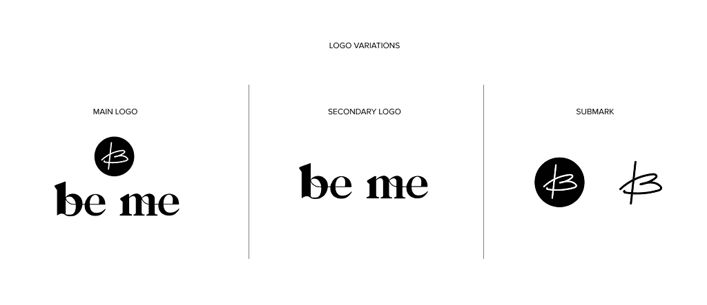
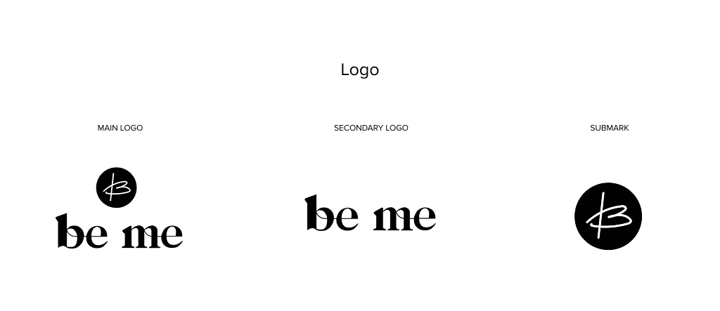
The Be Me wordmark was custom designed with a clean, modern, ligature-inspired approach that emphasizes simplicity and balance. Minimal letterforms and thoughtful spacing allow the logo to feel refined, timeless, and adaptable across digital, packaging, and marketing applications. Multiple logo variations were created to support flexibility across layouts while maintaining a cohesive brand presence.
The brand icon is a stylized “B” that subtly forms both a heart and a leaf, symbolizing self-love and sustainability. Designed for small-scale use, the icon functions as a standalone mark across favicons, social media, and product details, ensuring strong recognition even when the full wordmark is not present.