
ECAR is a conceptual digital marketplace designed to celebrate sustainable travel by connecting eco-conscious renters with hosts offering environmentally friendly cars. This project blends brand storytelling, editorial visual design, and interface design to elevate the experience of browsing and booking sustainable vehicles online.
Duration
Jan 2022
Skills
Art Direction, Visual Design, Branding, Digital Experience
Process

Problem
I conducted surveys from 10 potential users on their particular pain points when finding and booking sustainable cars online.
There needs to be integrated educational guides on car rental websites so that users could learn more about the ecological impact the cars have.
There is never a sustainability option for browsing and booking car rentals. Having a filter just for sustainable cars would make the experience of selecting a car a lot more streamlined.
There aren’t ways where car owners to market their cars to the right renters. Car owners find that when they’re listing their car for rent, it just gets lost in the large inventory of other cars.
Product Goals
Create an easy car rental search and booking experience with resources on eco-friendly cars so that customers can drive sustainably.
Increase brand recognition with a scalable and flexible design system. Maintain a consistent user interface and experience. Increase efficiency when designing.
Integrate educational guides to the website. Customers love customization and informative tools to make decisions.
Rent more sustainable cars than other car rental services. Build a simple and seamless browse, search, and check out experience.


Low-fidelity Prototype
I created low-fidelity wireframes in two phases: pre-test wireframe and post-test wireframe. After I got feedback for my pre-test wireframe, I iterated the post-test wireframe to adjust to the user’s needs.
These wireframes were designed before usability testing. They were quickly designed after sketching concepts for the app.


Performing User Testing
Participants
Male and female genders
Ages 21+
Live in USA
Eligible to legally drive (license required)
Methodology
Testing the app on a group of 10 participants.
See what kinds of information on the environmentally friendly features of each car people want to learn about
Collect data on how many rentals we get
We will see if the user flow is successful if we get more conversions (for rentals)
User Testing Questions
Is there enough information on the eco-friendly facts about the car?
Are users converting into sales?
How can we make the website simple to use in the least amount of steps?
How many users convert with mobile design vs desktop design?
Do users have the same shopping experience on mobile and desktop?
Are the features overwhelming for the user?
Pain Points
After designing the low-fidelity prototype, users tested the app to see where they ran into issues with the features of the app.
Not enough filters to tailor their search
Users feel like there aren’t enough filters to really customize what they really wanted.
Users want to see reviews
The original lo-fi prototype did not have a reviews section to see other renter’s experience with the host
Maps feature could be more interactive
Users would like to zoom in and out and see more recommendations
Users want more information on driving in certain weather conditions
Users want to feel safe choosing the right care for the certain weather conditions they’re going to be in.
User Tests: Findings
I conducted two rounds of usability tests. Each round was helpful in building the wireframe and prototype. Findings range from design aesthetic to functionality.
Search function
Users already know they want to rent a car for their trip and want to easily find the search function on the website.
Education
Users would like to see more information about the environmental impact of the cars.
Instant Booking
Users want quick instant booking to checkout without host approval. Great for those who need to rent last minute.
Themes
Confused on how to use some of the features
2 out of 5 total participants said that some of the buttons weren’t easily clickable.
“Is this supposed to be clickable?”
— 24 year old traveler
Doesn’t know how to navigate website
3 out of 5 total participants said the navigation
menu is confusing to use.
“Can the menu have more pages?”
— 30 year old driver
Booking is confusing
2 out of 5 total participants said figuring out how to book took too long.
“Is there a more instant way to book?”
— 27 year old participant
Design System
This is the design system that drives the look and feel of the website. The important parts of the design system are the brand identity and components.


Wireframe to Mockup
After designing the wireframe and the usability study, I used the design system to add in color, typography, images, and UI components to make the app come to life.

Hero section search bar
Similar to the Airbnb website, this website will have a search feature right on the hero section of the home screen. It is the first thing people see when they are on the website.

Car rental details
This is the page where we could learn more about the car and book from this page. As users scroll, there is a pop up CTA that stays fixed at the bottom of the screen so that users can quickly book.

Search results
I chose editorial-style photos for the car rentals. The bold and captivating images of cars gives the user a feel for the environment they’re driving in.
High Fidelity Prototype - Mobile
After building mockups, the next step was to create interactive prototypes of the app

Search function hero section of the homepage
The search function of the website is the most important because it’s where people start their booking experience. There inputs for location and dates and times for pickups. Once the user clicks on the search bar, it’ll expand to a large search function where people can specify where and when they need their car rental.
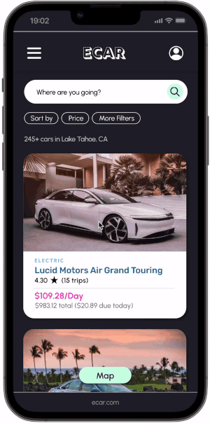
Filter your search results
You can filter and browse through your car options. Also, zoom in + out for the the map feature.

Car rental information
I went with more of an editorial style of design for the mobile version instead of the usual “boxy” style of design I’ve seen from other car rental websites. Hosts should tell a story about the experience driving their car. Renters should feel like they’re getting a taste of a completely different driving experience.

Booking experience
Book your stay with various payment options. There is also a “reserve now, pay later” feature so that people can book quickly without having to pay in full right away.

Homepage
Simple homepage design with a lot of CTAs to link to other pages. Also, designed a mobile menu with a search feature.


Search Function
The search function is the main feature of the website because it’s where people search for their car rentals. The inputs include where they user is traveling, pick up time and drop off time.
Best eco-friendly car for the snow
This website also suggests the best car for the environment you’re traveling to like snowy conditions, mountains, coastal areas, and deserts.
Best eco-friendly car for the snow
This website also suggests the best car for the environment you’re traveling to like snowy conditions, mountains, coastal areas, and deserts.
Get to know your car and the driving experience
I went with an editorial-style of design because users should feel like their reading a story by the hosts about how special their car is. Most car rental websites have a very mundane and boxy style. Users should feel like they could build a connection with their host.
Homepage
Users should feel like ECAR is also a reliable source for travel. They can also search cars by destination to see what kinds of amazing cars they can try out in other cities. Cars also have green scores to rank how great they are for the environment.
